How To Design High-Converting Pages Without A Designer

Struggling to create a landing page that actually gets results? A strong landing page can boost your conversion rate and grow your business fast. This guide will show you how to design high-converting pages, even without hiring a designer.
Keep reading to learn simple steps you can start using today!
What Makes a Page High-Converting?
A high-converting page grabs attention and keeps visitors engaged. It guides them to take action with a clear focus on their needs.
Clear Goals and Purpose
Set a clear goal for your page. Decide what action you want visitors to take, like signing up for an email subscription or starting a free trial. This helps keep the design focused and avoids clutter.
Make sure each section supports that main goal. Use headlines, concise copy, and strong call-to-action buttons to guide users. Highlight benefits that match their needs or pain points for better conversion rates.
Engaging Visuals and Layout
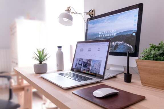
Strong visuals grab attention. Use high-quality images or videos to boost a page’s visual appeal. Choose photos that reflect your brand and connect with your target audience. Bright colors can highlight key areas, while simple designs keep the focus clear.
Organize the layout for easy reading. Break up text with white space to reduce cognitive load and improve user experience. Keep important content above the fold so visitors act quickly.
A good visual hierarchy guides users’ eyes naturally through the page, improving click-through rates and conversion rate success.
Design is not just what it looks like; it’s how it works. – Steve Jobs
Strong Call-to-Actions (CTAs)
Use direct and clear language for your CTA buttons. Phrases like “Sign Up Now,” “Start Your Free Trial,” or “Get Started” work well. Make the text short but action-oriented to boost click-through rates.
Place CTAs where users can easily see them, like above the fold or at the bottom of a section. Use colors that stand out from the rest of your page layout to grab attention without being overwhelming.
Essential Elements of a High-Converting Page
Strong pages catch attention fast and guide users easily. Simple details like trust badges and customer reviews can make a big difference.
Compelling Headlines
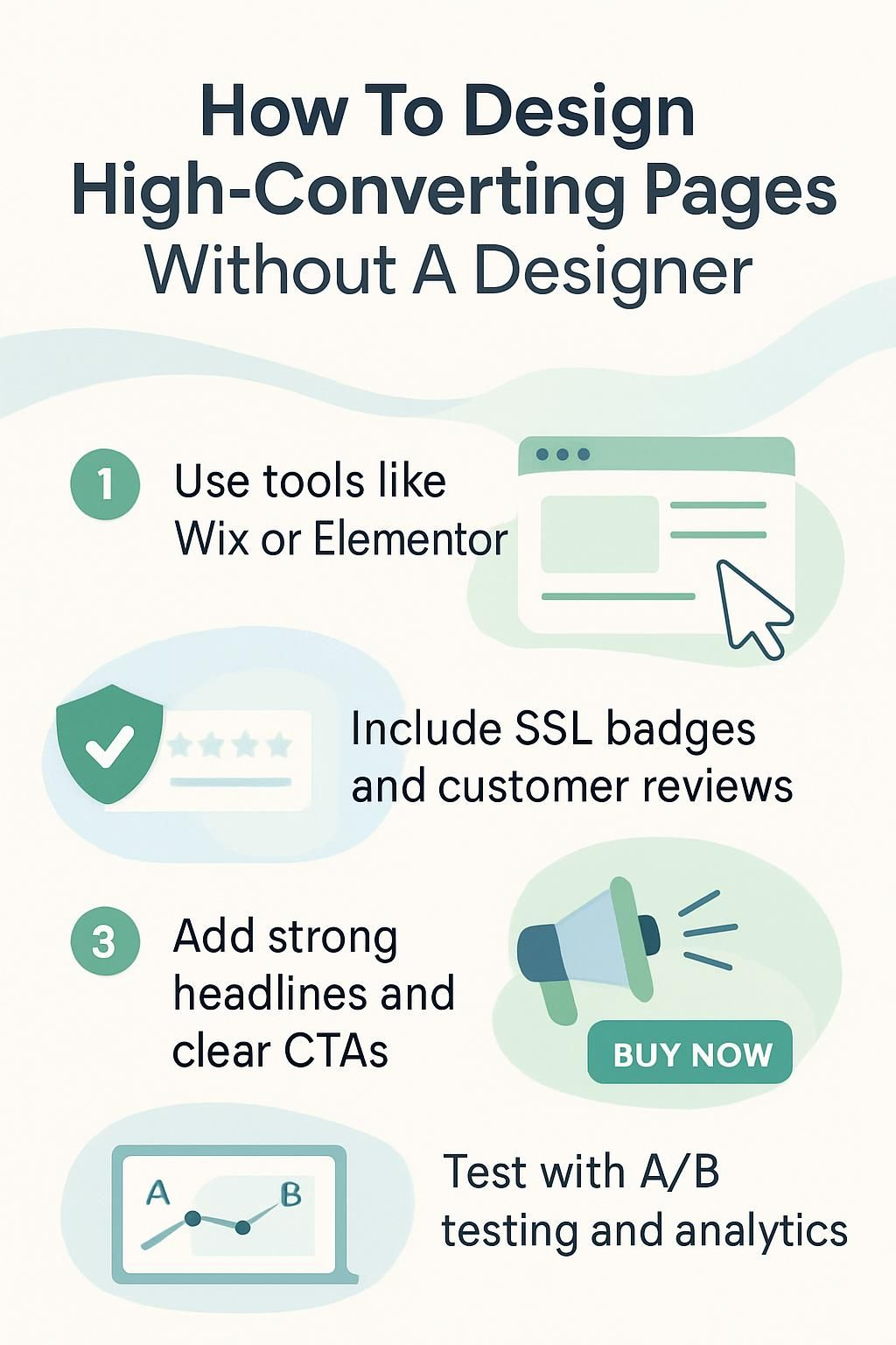
Catchy headlines grab attention fast. Use action verbs and highlight benefits. For example, “Boost Your Conversion Rate in 7 Easy Steps” sparks curiosity while offering value upfront.
Keep it clear and simple. Avoid long or complex phrases. Aim for emotional responses by addressing pain points like time, cost, or effort: “Save Hours Designing Landing Pages Without a Designer.”.
User-Friendly Navigation
A good headline grabs attention, but easy navigation keeps visitors engaged. Your landing page should guide users smoothly. Use a clear menu at the top or side. Limit choices to avoid confusion.
Include clickable buttons with short labels like “Learn More” or “Sign Up.” Make links stand out by using bold colors. Keep key actions above the fold for quick access. A clean layout improves user experience and reduces bounce rate.
Social Proof and Testimonials
Customer reviews build trust. People trust others who have used a product or service before. Adding testimonials from happy customers can make your landing page more convincing.
Use case studies to show real success stories. Share numbers, like higher sales or better results, to prove value. Show social media followers or likes as proof of popularity too. These small details boost conversion rates quickly.
Trust Signals (Security Badges, Guarantees)
Strong trust signals help users feel safe. Add security badges like SSL certificates or payment symbols at checkout. These show your page protects user data.
Include guarantees, such as a money-back promise. This reduces fear and boosts confidence in your offer. Keep these elements clear and easy to spot on the page for better conversion rates.
Step-by-Step Guide to Designing Without a Designer
You don’t need a designer to create a sleek landing page. Use simple tools, clear strategies, and thoughtful design choices to get it done.
Choose the Right Page Builder Tool
Pick a page builder that fits your needs. Tools like Wix, Elementor, or Leadpages are great for creating landing pages fast. These builders often use drag-and-drop features, making them easy to use even for beginners.
Look for a tool with pre-designed templates and mobile optimization. Make sure it supports fast load times and integrates with other tools like Google Analytics or email platforms.
Choosing the right tool saves time and boosts your conversion rate.
Define Your Audience and Goals
Understand who will visit your landing page. Think about their age, interests, and pain points. Use targeted marketing to speak directly to their needs. Tailor your call-to-action (CTA) based on what they want most, like a free trial or special offer.
Set clear goals for the page before designing it. Decide if the goal is lead generation, email subscription, or product sales. A defined purpose shapes every element of the layout and content.
Your value proposition should match these goals perfectly above the fold where visitors see it first.
Use Pre-Made Templates
Pre-made templates save time and ensure a polished layout. Many page builder tools, like Wix or Elementor, offer ready-to-use designs. These templates fit various industries and needs, from landing pages to online stores.
You can choose one that aligns with your goals and audience. Templates often include built-in features like white space, visual hierarchy, and call-to-action buttons placed above the fold.
This helps improve user experience and boosts conversions instantly.
Customize Templates to Match Your Brand

Disclosure: I am an independent ClickFunnels Affiliate, not an employee. I receive referral payments from ClickFunnels. The opinions expressed here are my own and are not official statements of ClickFunnels or its parent company, Etison LLC.
Adjust colors and fonts to reflect your brand identity. Pick a color scheme that matches your logo or website. Use consistent typography to maintain a professional look.
Add your logo, preferred imagery, and tone of voice for text. Keep branding uniform across all pages for better recognition. Small tweaks make templates feel unique while still being easy to use.
Add High-Quality Images and Videos
Using high-quality visuals adds personality to your page and boosts visual appeal. Pick images that reflect your brand’s message. Avoid blurry or low-resolution pictures, as they can lower trust levels.
Videos can explain complex ideas quickly. Use them for product demos, customer reviews, or testimonials. Place these above the fold to grab attention early. Ensure all media files load fast to reduce bounce rates and improve user experience (UX).
Write Concise, Actionable Copy
Strong words grab attention. Short sentences make your message clear. Focus on benefits, not features. Address pain points and offer solutions quickly. Use numbers or specific examples to boost credibility.
Place call-to-actions (CTAs) where users can’t miss them. Phrases like “Get your free trial” or “Start today” work well. Keep paragraphs short for better readability and engagement.
Make every word count toward conversion optimization goals.
Place CTAs Strategically
Make your call-to-action (CTA) buttons easy to find. Place them above the fold where most users will see them without scrolling. Use clear, action-driven words like “Sign Up” or “Get Started Now.”.
Keep CTAs visible as users scroll down the page. Add buttons near important sections such as testimonials, product details, or pricing tables. Use colors that stand out while matching your brand’s design for better visibility and conversion optimization.
Optimizing Your Page for Better Conversion

Make your page faster, mobile-friendly, and easy to use—small changes can boost your success.
Ensure Mobile Responsiveness
Your landing page should work well on all devices. Over 50% of web traffic comes from mobile users, so this is crucial for a high conversion rate. A page that looks messy or hard to use on a phone will lose potential leads fast.
Use responsive design tools like Wix or Elementor to ensure your site adjusts to different screen sizes. Test how your content appears on both phones and tablets. Check text readability, button sizes, and images for proper alignment.
Keep it simple for mobile users with fewer distractions and clear call-to-actions (CTAs).
Reduce Page Load Time
Fast-loading pages improve user experience and conversion rates. Slow load times increase the bounce rate, frustrating visitors before they engage with your content.
Optimize images by compressing them without losing quality. Use lazy loading for videos or large visuals to delay their load until users scroll down. Minimize unnecessary scripts and plugins to streamline your page performance.
Use A/B Testing to Refine Design
Test two versions of your page with A/B testing. Change one element at a time, like the headline, call-to-action (CTA), or button color. Track which version leads to a higher conversion rate.
Study the data from your test results. Use insights to improve layout, visuals, or text further. Keep experimenting to find what works best for your target audience. Move on to ensuring mobile responsiveness for better usability.
Examples of High-Converting Pages
Great landing pages grab attention fast and guide users to take action. See how top brands use clean design, clear messages, and strong calls to action for better results.
Spotify: Clear Messaging and Visuals
Spotify uses simple, direct messaging to grab attention. Their landing page highlights a strong value proposition, like “Music for everyone,” and offers a free trial right above the fold.
This clear headline shows what you get without extra effort.
The visuals are bold and clean. Spotify’s color psychology helps create focus with green accents against white space. They use high-quality images of happy users and dynamic content, connecting emotionally with their audience while improving the user experience (UX).
Airbnb: Minimalistic and User-Focused Design
Spotify proves the power of clarity and visuals, while Airbnb shows how simplicity wins. Its design focuses on minimalism. Clean layouts, lots of white space, and clear headings guide users easily.
Airbnb’s pages keep your actions simple. Buttons for booking or searching are bold and placed above the fold. High-quality images highlight listings, building trust instantly. This user-friendly setup reduces bounce rates and boosts conversions effectively.
ExpressVPN: Strong Value Proposition
ExpressVPN offers fast speed, strong security, and easy use. It protects your data with top-level encryption. You can browse safely on public Wi-Fi or access global content.
The service provides apps for phones, computers, and more. Features like a no-logs policy and 30-day money-back guarantee build trust. Its simple setup improves user experience while boosting online privacy.
Tools for Designing Pages Without a Designer
You can create professional pages using simple tools. These tools help you save time and improve your landing page’s look.
Drag-and-Drop Builders (e.g., Wix, Elementor)
Drag-and-drop builders like Wix and Elementor make designing pages easy. These tools let you build a high-converting landing page without coding. You can simply drag items, such as buttons or images, into place.
These platforms save time with pre-made templates that are mobile-friendly. They also allow you to add features like trust signals or customer reviews quickly. This helps improve user experience and boosts your conversion rate.
Image and Graphic Tools (e.g., Canva, Unsplash)
Canva helps you create stunning visuals quickly. It offers pre-made templates, easy customization, and drag-and-drop tools. You can design banners, infographics, or logos with no prior experience.
Unsplash provides free high-quality photos for your landing page. Use their vast collection to add visual appeal and grab attention. Pair these visuals with concise copy for better conversion rates.
Next, learn about analytics tools to measure success.
Analytics Tools for Tracking Performance
After creating your landing page, data analysis helps improve its performance. Tools like Google Analytics can show traffic sources and bounce rates. Heat maps from tools like Hotjar reveal how users interact with your page.
Use A/B testing platforms to compare design variations. Track conversion rate to measure success. These insights guide changes that boost engagement and return on investment (ROI).
Common Mistakes to Avoid
Avoid common traps like poor design choices or cluttered layouts—keep things clean and user-friendly to boost your landing page’s success!
Overloading the Page with Information
Cluttered pages confuse visitors. Too much text, images, or links overwhelms users and hurts the user experience (UX). A crowded landing page increases bounce rates because people leave when they can’t find what they need quickly.
Focus on concise copy paired with white space. Simple layouts guide the visitor’s mind toward your call-to-action (CTA). Highlight one pain point or value proposition at a time for better conversion optimization.
Poor Visual Hierarchy
Too much information can confuse readers, but a poor visual hierarchy makes it worse. Key elements, like your headline or call-to-action (CTA), may get lost if the layout lacks structure.
Users won’t know where to focus or what steps to take next.
Use white space wisely to make important sections stand out. Highlight headlines and prioritize CTAs above the fold. For instance, bold fonts and contrasting colors draw attention quickly.
By organizing content clearly, you guide visitors through your landing page with ease, boosting conversions.
Weak or Confusing CTAs
Weak CTAs confuse users. They don’t clearly tell people what to do next. Vague phrases like “Click Here” or “Learn More” lack purpose. A strong call-to-action (CTA) should be direct and specific, like “Start Your Free Trial Today” or “Download the Guide Now.” Use action verbs that match your goal.
Poor placement also reduces effectiveness. CTAs buried at the bottom of a page might go unnoticed. Place them above the fold for higher visibility. Make buttons stand out with bold colors and clear text.
Test different designs using A/B testing to find what drives better conversions.
Conclusion
You can create a high-converting page, even without design skills. Focus on clear goals, strong CTAs, and user-friendly layouts. Use tools like Wix or Canva to make your work easier.
Keep testing and improving for better results. A simple, smart approach can boost your conversion rate fast!