The Psychology Behind High-Converting Order Forms

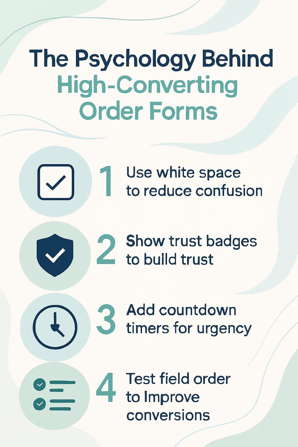
You may wonder why your landing page gets lots of visitors but few people finish the order form. Studies show that high-converting forms use psychology to boost conversion rates and lower form abandonment.
In this post, you will learn simple tips to improve your order forms using social proof, clear trust signals, and user-friendly design tools like progress indicators and call-to-action buttons.
Keep reading to see how small changes can make a big difference in lead generation for digital marketing success.
The Role of First Impressions
First impressions matter. A simple and clean design grabs attention fast. Use visual cues, like size and color, to guide your users. This helps them find what they need without confusion.
Importance of simplicity and clean design
A simple and clean order form keeps users focused and calm. If you only ask for essential information, you lower cognitive load. White space gives eyes a rest and helps guide attention to key fields.
Big, clear headings work with visual hierarchy so users know what comes next. Users find it easier to finish forms that use short instructions and avoid clutter.
Clear field labels speed up the whole process—no guessing or confusion slows people down. Sites using these tricks reduce form abandonment rates by a lot, making customers more likely to buy or sign up.
Think of top brands like Shopify or online stores that use bold buttons, easy-to-read text, and lots of space around each step. A simple design leads to better user experience (UX) on both desktop screens and mobile devices, which improves conversion rates fast.
Visual hierarchy to guide user flow
Clear headings help you move through an order form without getting lost. Bold titles stand out, showing you what to do next. Ample white space lets your eyes rest, making each section easy to read and follow.
If you see a big call-to-action button in a bright color, you know where to click first.
Progress indicators—like step numbers or progress bars—show where you are and how much is left. This structure lowers cognitive load and keeps things smooth, even if the order form has several steps.
By putting important details up top and grouping similar questions, your decision-making speeds up.
Place information in a logical order; for example, ask for the email before payment info. Sites like Clickfunnels use visual cues so users keep moving forward instead of abandoning their cart halfway through.
This setup often raises conversion rates by guiding user behavior with simple design choices.
Good design is obvious; great design is transparent.
The Rule of Reciprocity
The Rule of Reciprocity is simple. When you give something valuable, people feel more inclined to return the favor. It could be a free trial, helpful tips, or a special discount. This approach builds trust and encourages action on your order form.
Offering value before requesting information
Show your visitors why filling out your order form is worth it. Mention clear benefits, like 10% discounts, free trials, or exclusive content. Use prominent call-to-action buttons that highlight what users will get instantly.
This sparks user engagement and lowers friction.
Place trusted brand logos and customer testimonials near the top of your high-converting forms. These trust signals boost customer confidence before you ask for email addresses or payment details.
Add a countdown or limited-time offer to increase urgency and reduce cart abandonment risk. Always keep fields short to lower cognitive load so more people complete the form.
Leveraging Social Proof
People trust others. When they see reviews and ratings, they feel more confident. Customer quotes can help you shine a light on your product or service. Trust badges also build confidence.
Showing that many people use your offering makes it feel safe to buy. Want to know how social proof can boost your sales? Keep reading!
Testimonials, user statistics, and trust badges
Testimonials show that others trust your product. User statistics and trust badges boost that trust even more.
- Customer testimonials serve as social proof. They demonstrate how past buyers feel about what you offer. Sharing their positive experiences helps new customers feel confident in their choice.
- User statistics can highlight your popularity. Showing the number of satisfied customers or major brands that use your product builds credibility. This kind of information indicates that many people have found value in your service.
- Trust badges add a layer of security to your order forms. These symbols, like SSL certificates or money-back guarantees, reassure users that their information is safe. When they see these badges, they are more likely to proceed with their purchase.
- Awards and expert endorsements boost your authority. If a trusted source endorses you or if you’ve won awards, people take notice. These recognitions help establish reliability in your brand.
- Displaying customer reviews makes it easier for potential buyers to relate to others’ feelings and thoughts about your product. Seeing real feedback from real users encourages new customers to trust you.
- Consistent use of testimonials and user stats on landing pages can enhance conversion rates over time. Each positive note adds up and influences other users’ decisions, making them more likely to follow through with purchases.
- Combining all these elements creates a powerful strategy for building customer loyalty and trust in your brand’s offerings at every touchpoint along the customer journey.
Reducing Friction in the Process
Reducing friction makes it easy for users to fill out forms. Use fewer fields and keep tasks simple. Clear labels help users understand what they need to do. Inline validation shows them when they make a mistake right away, which boosts their confidence in completing the form.
Limiting form fields and simplifying tasks
High-converting forms work best when they ask for only the essentials. This keeps users focused and reduces any frustration.
- Keep form fields to a minimum. Only ask for what you really need, like name and email. Too many fields can overwhelm users.
- Simplified labels are key. Use clear terms that everyone understands. This makes it easy for users to fill out your form quickly.
- Clear headings break up sections. They guide users smoothly through the process, making it feel less like a chore.
- Consider using progress indicators. These let users know how far along they are in the process, reducing anxiety and encouraging completion.
- Prominent call-to-action buttons help make choices clear. Ensure these buttons stand out on the page, drawing attention at crucial moments.
- User behavior shows that fewer steps mean higher conversion rates. A simple process leads to more people finishing their orders instead of abandoning them.
- Inline validation is helpful for instant feedback. If a user makes an error, they get immediate notice, which helps keep frustration low.
- Reduce cognitive load by having a clean design with ample white space. This allows users to focus without distractions, making the whole experience smoother.
These strategies will help you create forms that convert well while enhancing user experience (UX).
Clear labeling and inline validation
Clear labeling and inline validation are essential for smooth order forms. These elements help users fill out forms easily. They make the process less frustrating.
- Clear labels tell users what to enter in each field. This helps reduce confusion and errors while they fill out the form.
- Good labeling builds confidence with users. When they see familiar formats, they feel more comfortable.
- Inline validation provides instant feedback on entries. If something is wrong, users can fix it right away, lowering their chances of leaving the form.
- Proper instructions linked to labels improve understanding. Users know exactly what is needed, reducing cognitive load.
- Positive messages pop up when a field is filled correctly. This reinforces good behavior and encourages them to keep going.
- Effective labeling can significantly reduce abandonment rates in order forms. Users are less likely to leave halfway through when forms guide them smoothly.
- Labels that match user expectations create a better experience; this increases conversion rates and keeps user engagement strong.
Clear labeling and inline validation work together to improve UX design and lead generation effectively!
The Power of Clarity
Clear instructions help users feel confident. Use simple words and short phrases to guide them easily through your form. Visual cues, like arrows or highlights, can show the way. Keep things straightforward to lessen any confusion that may arise.
This builds trust and encourages them to complete their tasks without stress.
Avoiding confusion with concise instructions
Clear instructions help users feel secure. Make your order forms easy to understand. Use simple language and short sentences. Avoid long paragraphs; they can confuse people. Give step-by-step guidance for each part of the form.
Highlight important points with bold or colored text. This makes them stand out. Show examples if possible, so users know what to do next. Use visual cues like arrows or icons for direction too! Keeping everything clear reduces cognitive load, helping users finish their tasks quickly and easily.
Creating Urgency and Scarcity
Creating urgency and scarcity can boost your sales. When you show a countdown timer or mention limited-time offers, it makes users act fast. They don’t want to miss out! This tactic taps into loss aversion—people fear losing a great deal more than they enjoy gaining one.
Use social proof like customer reviews or testimonials to strengthen this feeling. Show that others are taking action too, and help guide them toward the call-to-action button!
Using countdowns or limited-time offers
Countdowns and limited-time offers create a sense of urgency. Users feel the fear of missing out, or FOMO. This can push them to act quickly. A countdown timer on your order form shows how much time they have left to grab a deal.
It makes those offers seem more valuable.
Clearly showing rewards boosts motivation too. For example, if you offer a discount for signing up today, people are more likely to fill out the form fast. Scarcity tactics work well too, like saying stock is low or that an offer ends soon.
These methods help increase conversion rates by making users feel they need to act now or risk losing something great!
Personalization to Build Connection

Personalization helps you connect with your users. When forms show content based on their actions, it feels more special. They see that you understand them… This makes them more likely to complete the form and engage with your offer.
Want to learn how to personalize even better? Keep reading!
Dynamic content based on user behavior
Dynamic content makes your order forms feel personal. It changes based on what users do. For example, if you notice a visitor looking at specific products, show them related items or offers.
This type of customization can increase engagement and boost conversion rates.
Using dynamic content keeps users interested. It helps guide their journey through the form. By adding messages that relate to their actions, you create a stronger connection with them.
This approach leads to better user experiences and encourages more people to complete their purchases. The next step is exploring the impact of microcopy on conversions.
The Impact of Microcopy
Microcopy plays a big role in guiding users. Short texts, like prompts or labels, can motivate them to take action. Clear instructions help avoid confusion and reduce anxiety. Good microcopy also builds customer trust, making your order form feel safe and friendly.
Use simple phrases that connect with their feelings, like “You’re just one step away!” This creates urgency while enhancing the user experience. So pay attention to those little words; they can make a big difference!
Encouraging action with helpful and motivational text
Use motivational text to encourage action. Highlight the benefits of completing the order form. Let users know they are making a great choice! Phrases like “Get started now!” or “Join the community today!” can inspire them to take that next step.
Show urgency with limited-time offers. Use persuasive words to prompt immediate actions. Add helpful tips alongside the form, making it feel easy and fun. Encouraging microcopy also boosts satisfaction; words like “Great choice!” after selecting a product make users feel good about their decisions.
Friendly reminders, such as “You’re almost there!”, keep them engaged and reduce drop-offs in the process.
Trust Signals and Privacy Assurance
Trust signals are key in online forms. They show users their data is safe. Badges, security icons, and privacy policies help build trust. When customers see these signs, they feel secure enough to share info.
Make sure your form has these elements for better conversions… It can really boost confidence!
Highlighting security features and privacy policies
Show security features clearly. Use trust signals, like SSL certificates or secure payment icons. These make people feel safe. Add your privacy policy link in a visible spot. Explain how you protect user data and why it matters.
Make sure the language is simple and clear. Avoid technical terms that may confuse users. Your audience needs to see you care about their safety and privacy. This builds customer trust, which can improve conversion rates over time.
Visual Cues and Directional Flow
Use arrows or progress bars to lead users through the order form. These visual cues make it clear what steps they need to follow next. A good flow keeps their attention and helps them finish the process without feeling lost.
Curious about how small changes can boost your conversion rates? Keep reading!
Using arrows or progress bars to guide users
Progress bars and arrows can really help users on order forms. They show how far along you are in the process. This visual cue makes it easier to know what comes next. A clear path reduces anxiety and keeps you engaged.
Arrows point the way through each step of the order process. You won’t feel lost or confused when filling out a form. Good placement of these cues also boosts user experience, making it smoother for everyone involved.
Using these simple tools can lower abandonment rates too!
The Effect of Emotional Triggers
Emotional triggers can make a big difference in how people respond to your order form. When you connect with their feelings, like fear of missing out or desire for success, they’re more likely to act—like clicking that call-to-action button.
Connecting with users’ desires and fears
Users want a smooth experience. They fear confusion and frustration. To ease these worries, keep your forms simple. Reduce the number of fields to fill out. This lowers cognitive load and makes it easier for users to complete their tasks.
Building trust helps too. Show testimonials and recognizable logos on your order forms. This addresses concerns about credibility. Highlight security features, so customers feel safe sharing information.
A clear process boosts confidence and reduces fears of abandonment while filling out the form. Users desire clarity and guidance; use visual cues like progress bars to help them along the way.
Testing and Optimization
Testing and optimization are key. You can try A/B tests to see what works best for your order forms. Changing just one thing, like a button color or text, can lead to higher conversion rates.
It’s all about finding out what your users respond to… so keep testing and improving!
Implementing A/B tests for form effectiveness
Implementing A/B tests helps you find the best way to design your order forms. These tests can boost your conversion rates and enhance the user experience.
- Choose what to test, like button colors or field layouts. This helps you see what small changes can make a big impact on form design.
- Split your audience into two groups. Show one group version A and the other group version B of your form.
- Track how each version performs. Look at metrics like form completion rates and how many users abandon the form.
- Analyze the results after a set time period. Find out which version gets more users to complete their orders.
- Make adjustments based on data collected from the tests. Use what works best in future designs to increase lead generation.
- Run A/B tests regularly to keep improving forms over time. User behaviors change, so constant testing keeps your forms effective.
- Utilize tools for A/B testing like Google Optimize or Optimizely, which help streamline this process and provide valuable insights.
Using these methods will guide you toward creating high-converting forms that engage users effectively and reduce cart abandonment rates seamlessly.
How Coaches Can Use ClickFunnels to Get More High-Ticket Clients
Coaches can use ClickFunnels to attract high-ticket clients. First, focus on your landing page. Make it clean and simple. Highlight what you offer clearly. Use strong visuals to guide visitors through the page without confusion.
Add social proof like testimonials or customer reviews. People trust others’ experiences. This can boost your conversion rates a lot! Create urgency with limited-time offers, which taps into the fear of missing out (FOMO).
Also, make sure forms are easy to fill out with only key fields needed. A shorter form means less chance for abandonment. With Clickfunnels, you have tools for customization too; think about using conditional logic for personal touch based on user behavior that keeps them engaged!
Conclusion
Understanding the psychology behind high-converting order forms is key. Using simple designs can make a big difference. Clear instructions help users feel confident. Social proof builds trust and encourages action.
By creating urgency, you inspire quick decisions. Focus on connecting with your audience’s emotions for better results. Embracing these ideas can boost your conversion rates and grow your business effectively!